Colours
The KRONE colours
One of the most decisive style elements for our brand is colours. Due to our machine design, the colours green and beige are well-known worldwide. In communication, we use our green very strongly to represent our values in the best possible way.
Primary colours
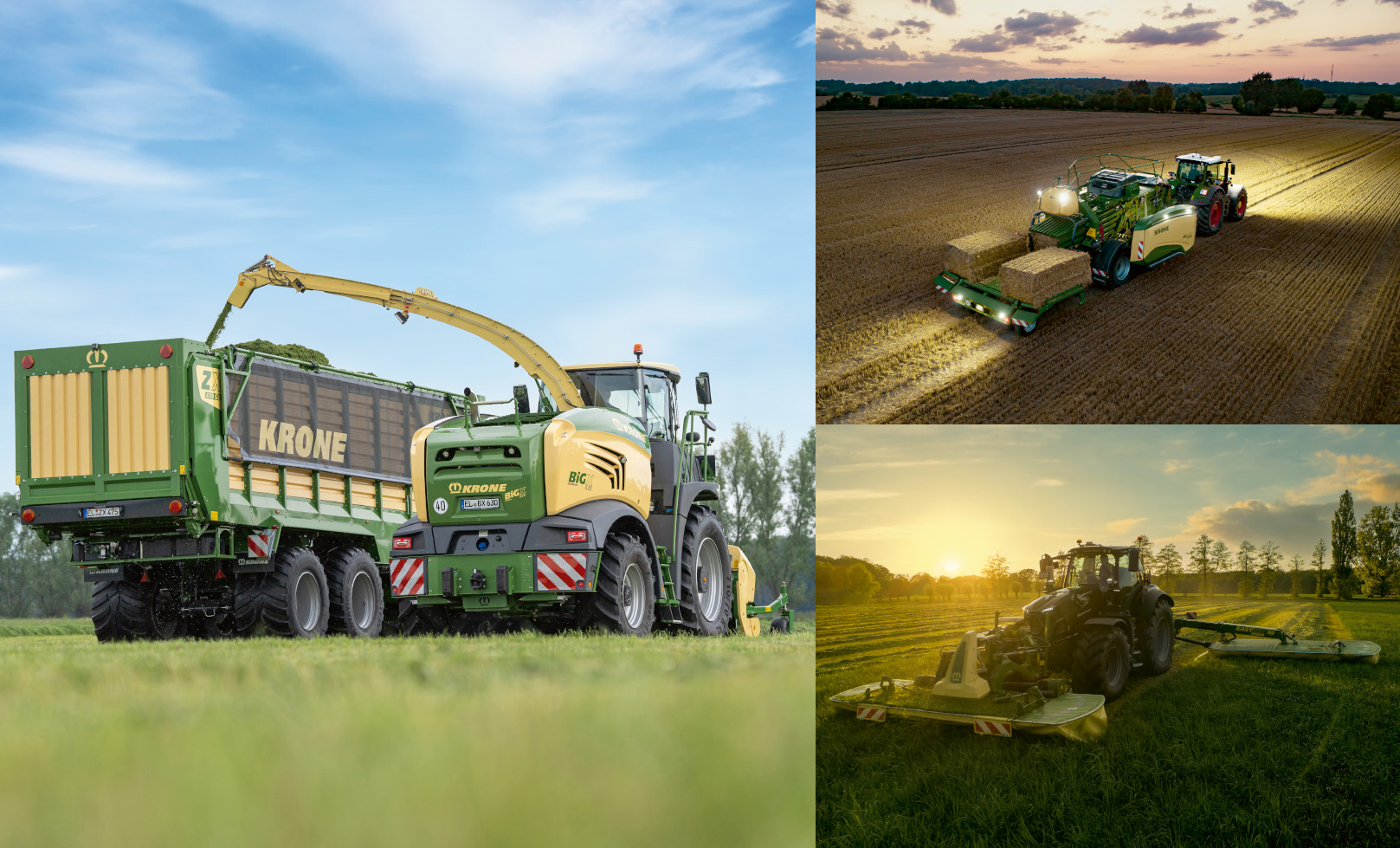
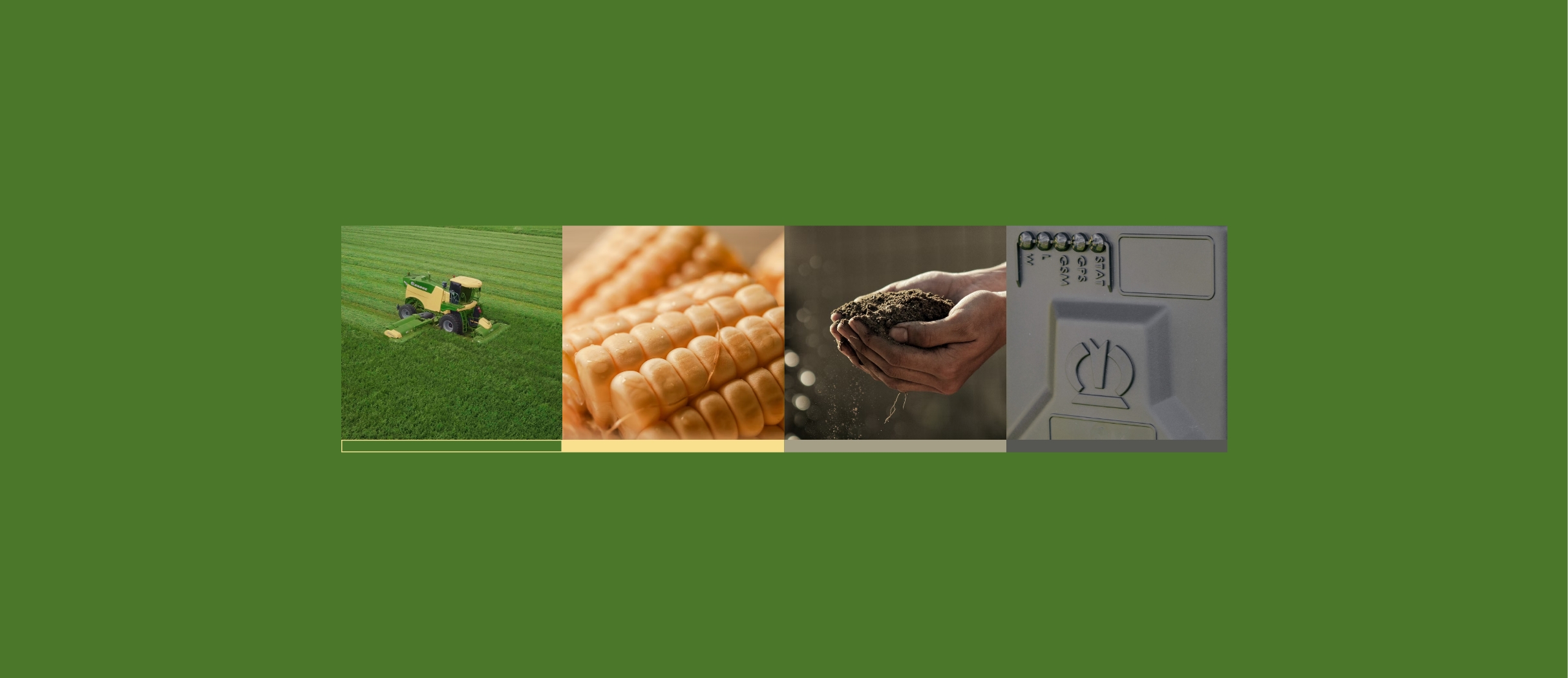
The colours are inspired by the use of our machines in the field. Whether green grass, golden wheat, or fertile soil – our machines leave their mark on agriculture. Our main colour is of course the striking green “Grass” from KRONE. This colour should be present in every medium at every time. The yellow tone “Corn” is only relevant for our machine design and is not used for communication design.
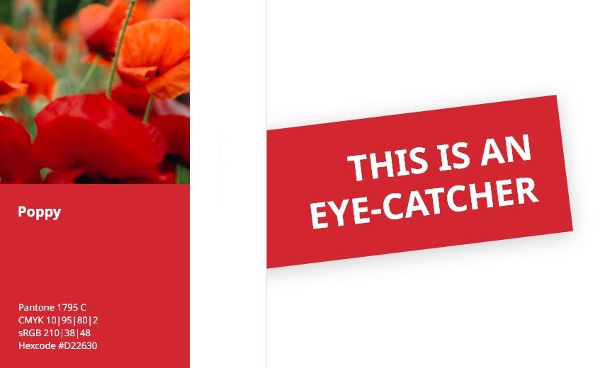
Highlight colour
What might be the most eye-catching little thing in agriculture? Of course, it’s the red Poppy Flower! Poppy Red is perfect as a contrast to our primary colours because of its signal effect. The colour is mainly used for our eye-catcher elements. You can find more about this in the “design elements” section.
Percentage colour distribution
Our colours are used in a certain ratio. This can vary depending on the area of application. The percentage distribution is a recommended guideline and does not have to be strictly followed. But always keep in mind: green is our main colour and should be present everywhere.

Communication design

Machine design
Colour shades
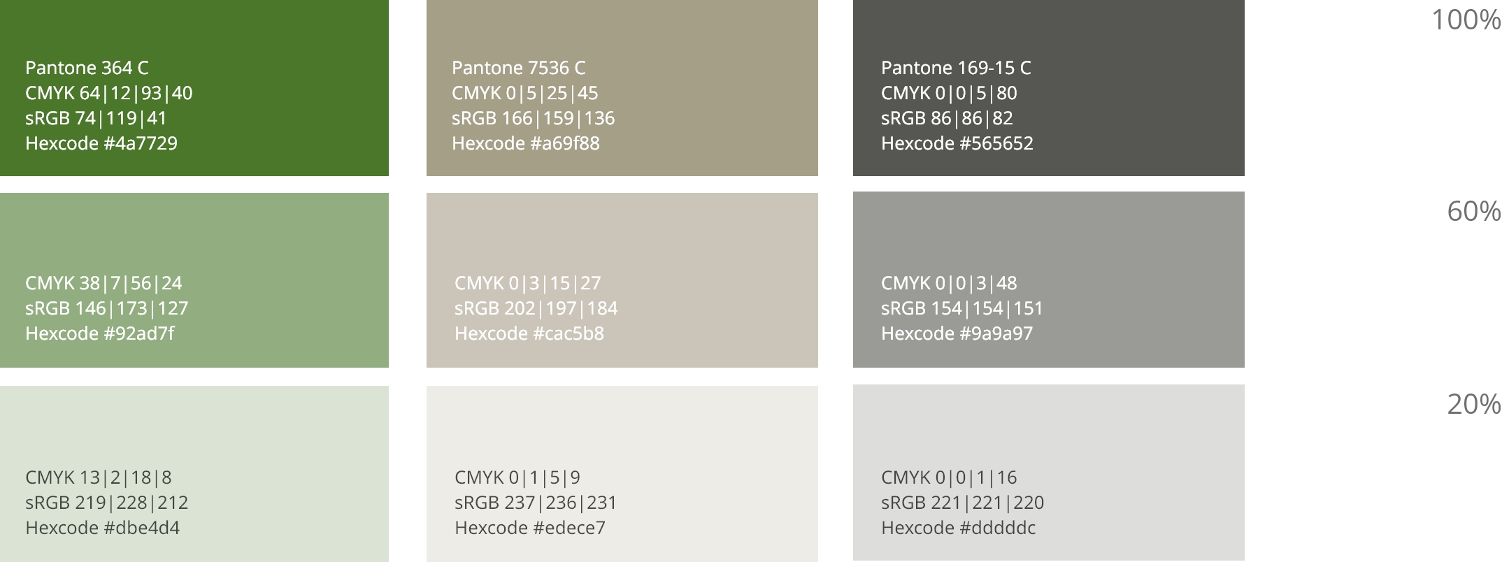
There are two shades of each of our colours which are primary used in communication design. The shades are consistent for every colour and easy to remember.
Black and white as a base
In addition to the brand colours, black and white are used for certain basic elements. For example, white always serves as the basis for all media. For some elements, the exact gradation is flexible and depends on the area of application.
KRONE Colour Libraries Download
aes/zip
1 kb
KRONE Colours CMYK
aes/zip
0,5 kb
KRONE Colours RGB
aes/zip
0,5 kb
All colours are also included as hex colour codes in our Basic UI Kit. So if you want to develop a UI design, just download the Basic UI Kit.
