Typography
About our typography
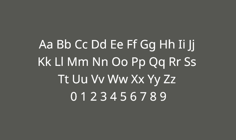
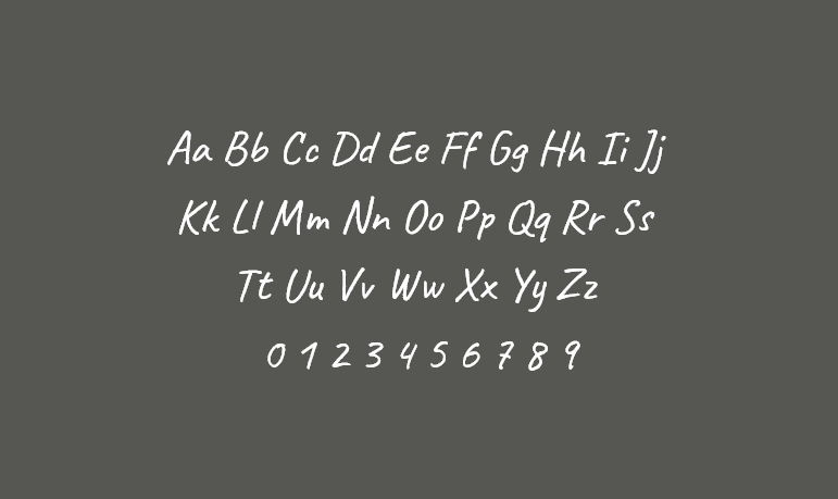
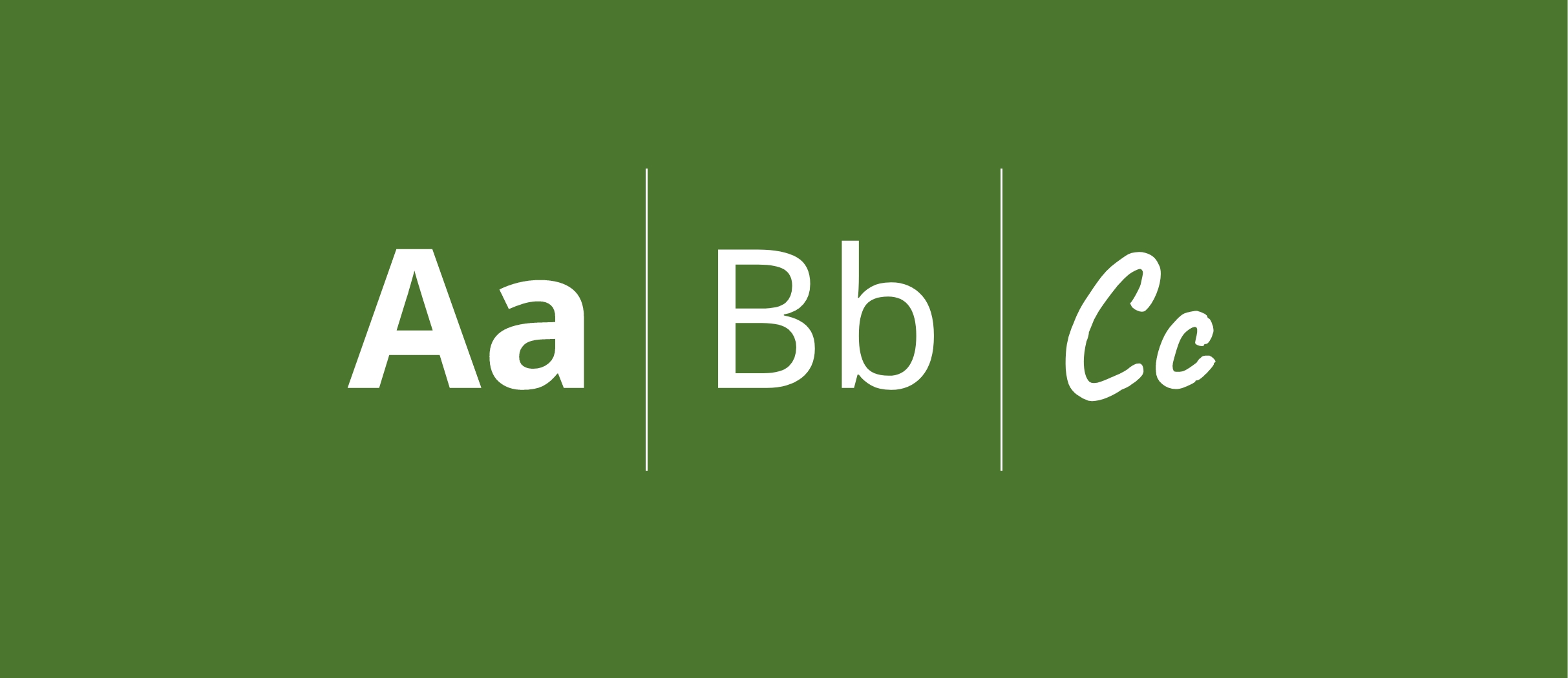
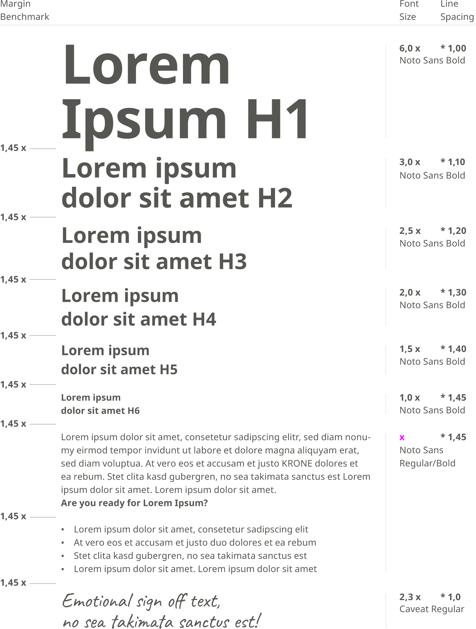
At KRONE, we use two fonts for different purposes. For body text and headlines, we use the linear, high-quality “Noto Sans” font. For more emotional typographic elements such as quotes or signatures, we use the handwritten font “Caveat”.
Typo conditions
Every medium is different and comes with different requirements. Depending on the size, format, and platform, completely different font sizes are required. For this reason, there are no absolute specifications for font sizes at KRONE, but rather relative ratios that work across all media.
The reference value is always the font size (x) of the body text and is defined for each medium. All other formats, such as headlines, sublines, etc., are used proportionately. For example, our tallest headline is six times taller than the body text.
Kerning
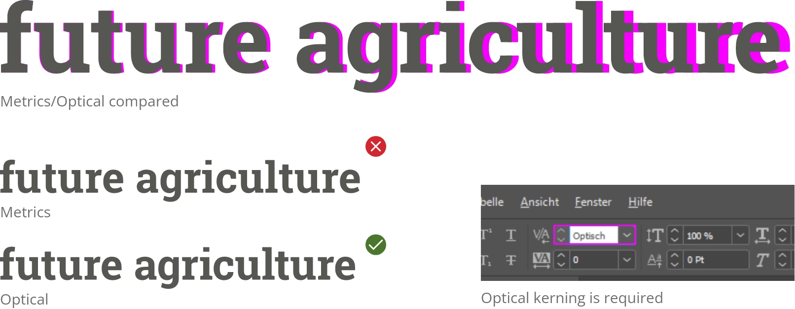
Kerning means adjusting the spacing between characters in a proportional font to achieve a visually pleasing result. By using optical kerning, we create a balanced letter spacing in texts. Especially with larger typo formats, such as headlines, you should manually adjust the kerning again.
Special headline formats
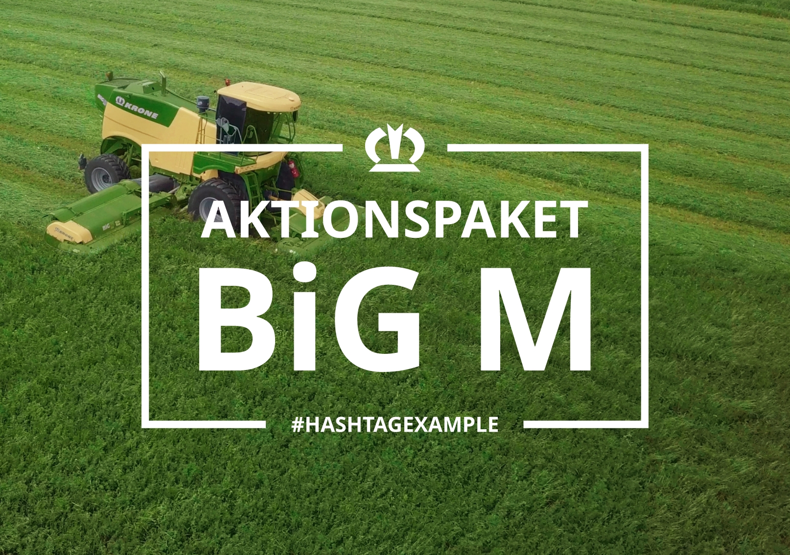
Some of our headline formats are used as a recurring style element and thus contribute to the recognition of our brand. This format contains our logo, outline, hashtag, and headlines, of course.
This format is only relevant for Covers and Introductions as a the first main headline of the document.
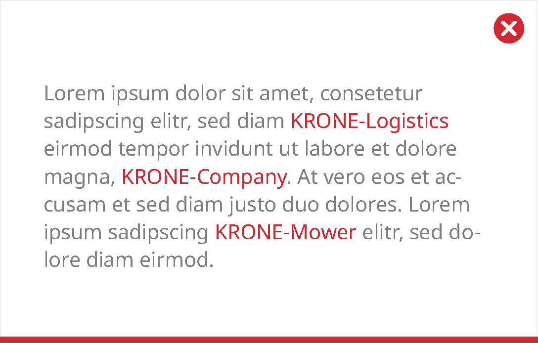
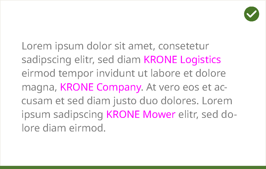
Correct spelling of KRONE
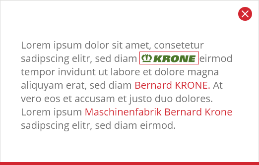
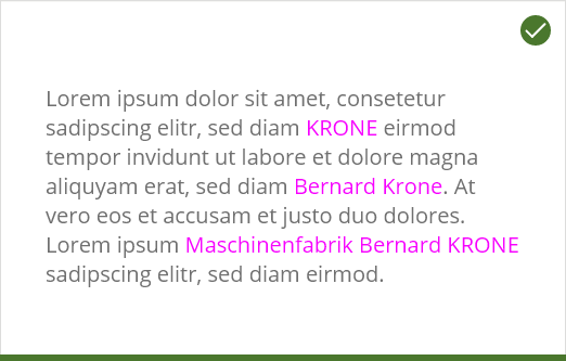
Although the brand name KRONE and the surname/family name Krone are identical, we carefully differ their spelling! We ALWAYS write our brand name KRONE in capital letters, not the family name Krone.
The KRONE brand always stands alone and is never connected to other words with a hyphen.
Correct spelling of product names
The machine names BiG Pack, BiG M, and BiG X are always written with a capital B and G, and a lowercase i.
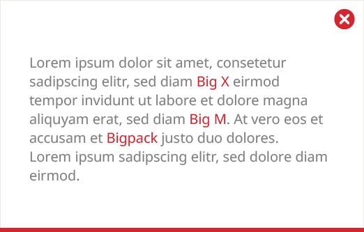
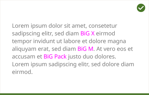
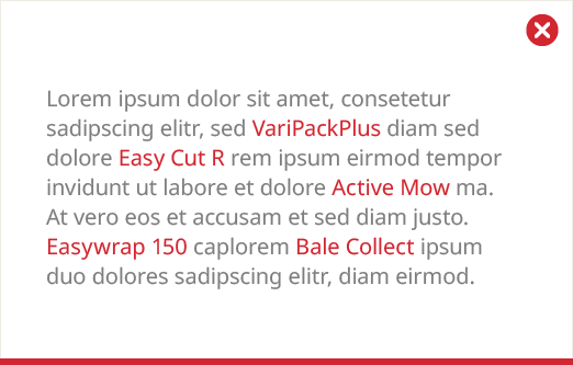
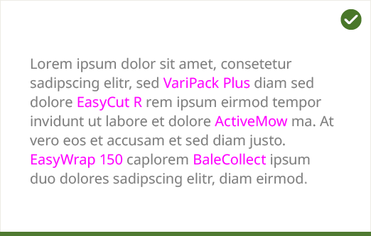
Machine names such as VariPack, EasyCut, ActiveMow, EasyWrap, and BaleCollect are each written as one word, with the second component – Pack, Cut, Mow, Wrap, and Collect – starting with a capital letter.
