Logo
The evolution of our company logo
The KRONE brand was named after our founder Bernard Krone. To this day, the company is managed by the Krone family and bears their name. It all started in 1924 with a reduced, geometric logo. After a good 24 years, it was further developed and the ear of corn was added as an agricultural element. In addition, the crown as a symbol has been anchored in the second generation of the logo. In the third generation of the logo, the ear of corn, the crown symbol, and the family name still play a major role but are used in a more reduced way. Overall, the logo has evolved over the various generations from a word mark to a picture-word mark to a combination of picture and word mark. In the fourth generation, the logo was strongly abstracted to meet modern, aesthetic requirements. The last Change in 2023 is a slight optimization for more readability and a straighter typography.

The KRONE Logo
Our logo consists essentially of only one element – the crown. It is represented both figuratively and typographically, and it represents the family name Krone. Since the abstraction in 2000, the logo has been much more reduced and geometric. Through cursive typography, it stands for progress and innovation.
We can use the logo in two different variants. Primarily, the image-word combination should be used. Especially if the logo is used on smaller areas, the figurative mark may be used alone.
Download the logo
KRONE Logo Package
zip
9 mb
Positioning and spacing
A protective space around the logo is important to let the logo “breath”. This is to avoid unintentional connections to other elements or even being disturbed. The protective space results from the height of “KRONE” or half the height of the logo and is maintained both horizontally and vertically. The positioning of the logo is prioritized at the top right corner, alternatively at the bottom right.
Logo behaviour & dimensions
The size of the logo depends on the medium. For example, the logo on a business card is much smaller than on a poster. As a basic rule, the logo should occupy between 15% and 25% of the media width. Especially with small formats, the picture word mark might be problematic because there is not enough space or the logo is too small. In these cases, make use of the image mark only.
Don’ts
The correct use of our logo is supposed to prevent it from being badly readable, altered, or not meeting our quality standards. Below you can find a few examples that we should avoid.

Logo misuse: compressed.
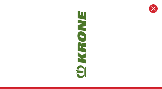
Logo misuse: rotated.

Logo misuse: too little protective space to the outside.
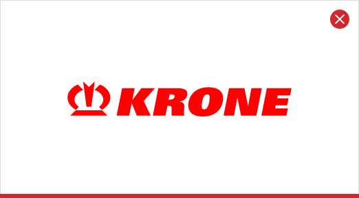
Logo misuse: wrong colour.
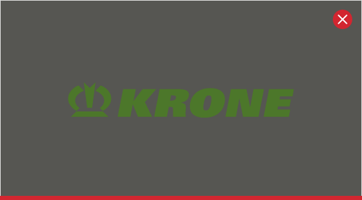
Logo misuse: too little contrast.
Logo misuse: too little contrast.

Logo misuse: wrong placement and size relation.

Logo misuse: old logo with old slogan.
Application with coloured areas
Positive
Negative
Use of the Logo in images
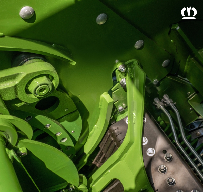
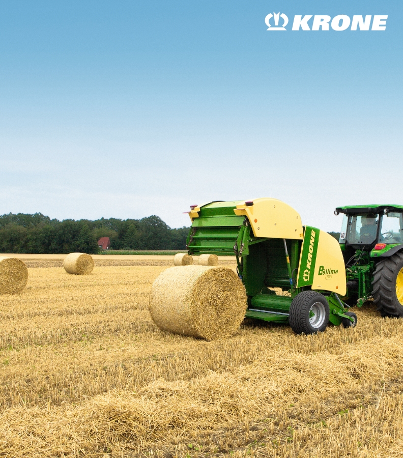
In images, the logo is placed in one of the corners but never in the centre. The logo is used as a positive or a negative, depending on the conditions of the image. The logo is always placed exclusively without shadows, frames, or other effects on the images. If necessary, areas of the image can be darkened to ensure that the logo is easily readable.

